
Back to School Barbecue 2025
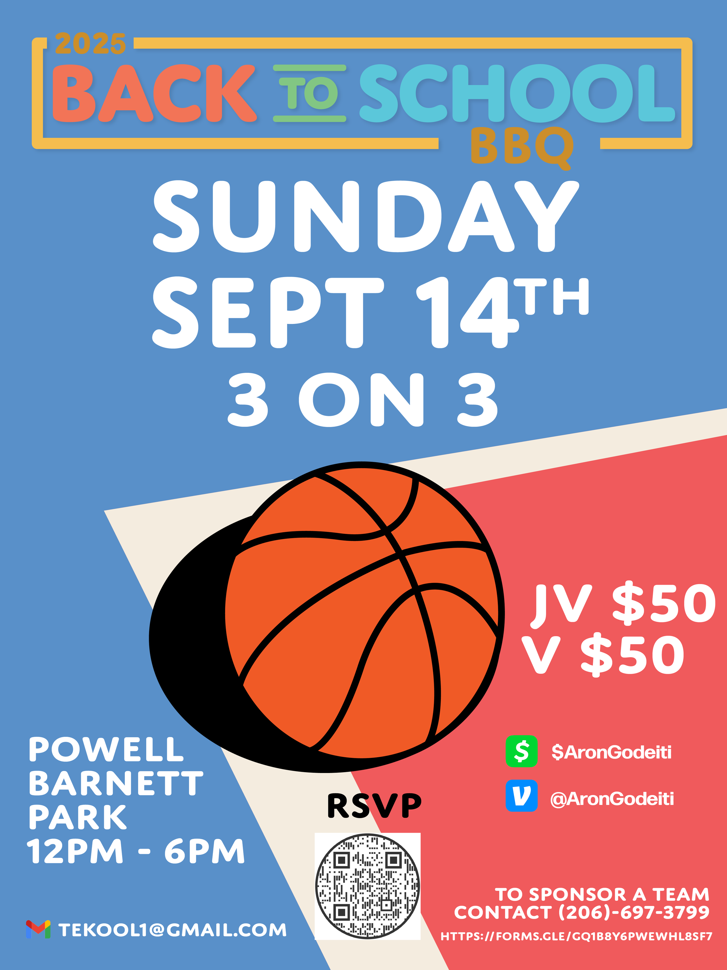
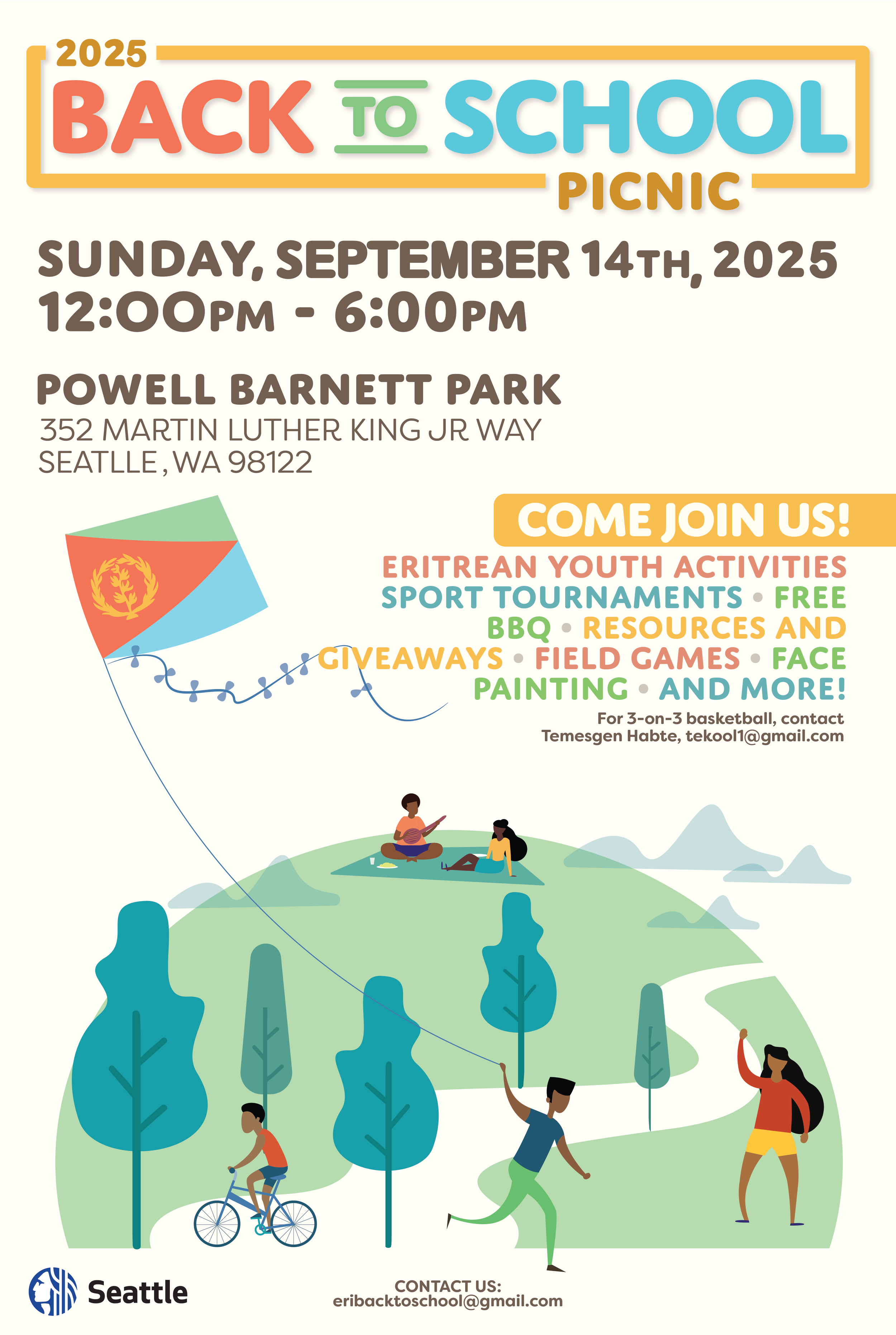
2025 Back to School Picnic
Community Event Poster & Visual Campaign
Client / Context
Eritrean Community Organizers · Seattle, WA
Role
Graphic Designer
Concept development, visual strategy, illustration direction, layout, and accessibility considerations
The Challenge
The goal of this project was to promote a Back to School community picnic for Eritrean families in Seattle, with a strong emphasis on youth engagement, family participation, and access to resources.
The audience included:
Parents and caregivers
Youth and teenagers
Multigenerational community members
People with varying levels of English fluency
The key challenge was to communicate a lot of logistical information clearly—date, time, location, activities, and contact details—while also creating a welcoming, joyful visual that reflected community, safety, and belonging. The poster needed to feel inviting rather than institutional, and culturally resonant without relying on stereotypes.
Strategy
I approached this as a public-facing, equity-centered communication piece, similar to how transit agencies design materials for diverse riders.
My strategy focused on three principles:
Clarity First
Essential information (event title, date, time, location) is prioritized at the top with strong typographic hierarchy, ensuring quick comprehension at a distance or glance.Inclusive Visual Storytelling
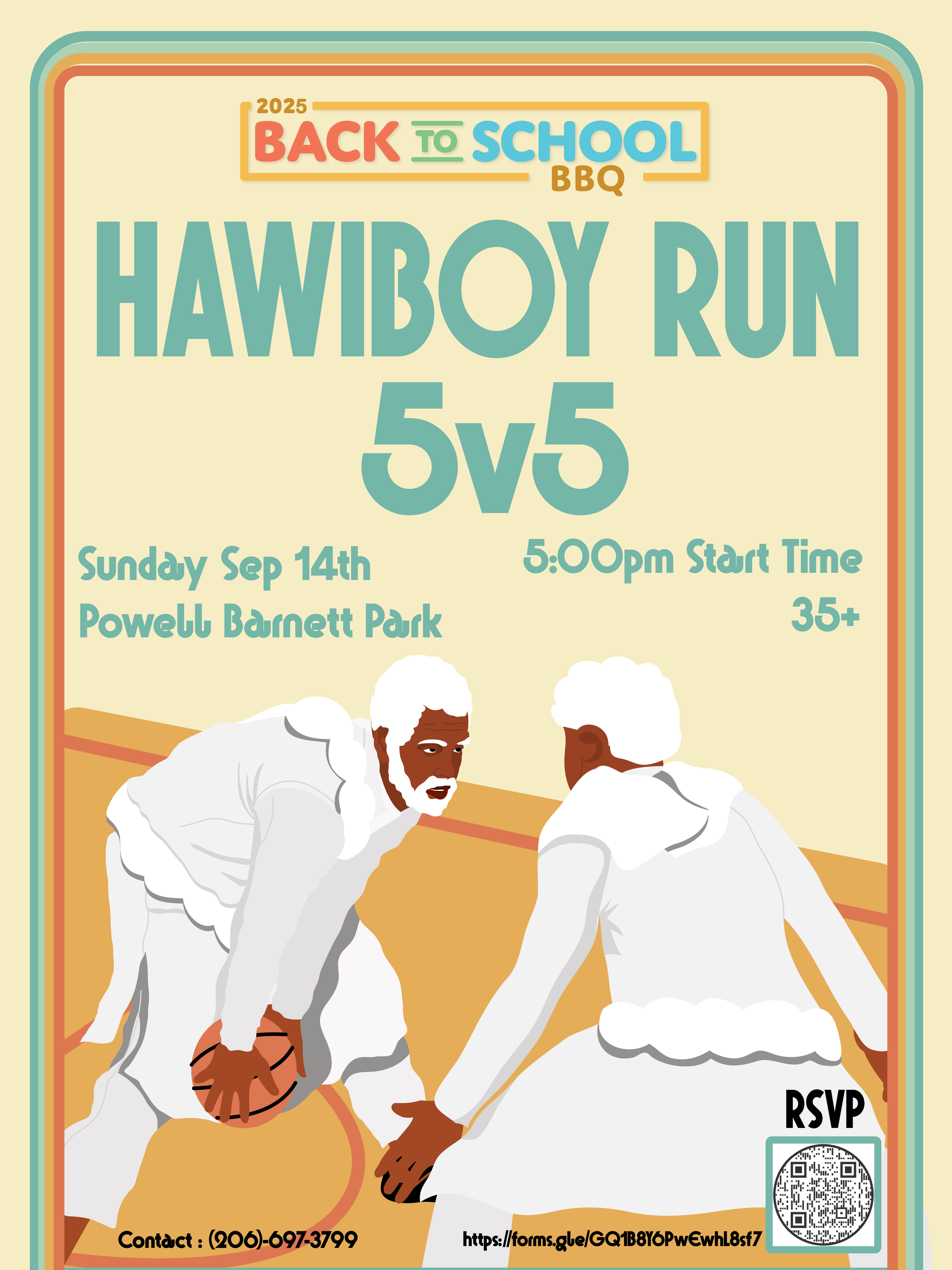
Instead of using photography, I chose illustration to create a universal, friendly environment that reflects families of different ages engaging in everyday activities—playing, biking, flying a kite, relaxing in the park.Community Trust & Warmth
The design needed to signal that this is a safe, welcoming, family-oriented space. Soft colors, rounded typography, and playful illustration styles help reduce barriers and invite participation.
Design Solution
Visual Language
A warm, pastel color palette was used to evoke approachability, joy, and outdoor summer energy.
Rounded, bold typography reinforces friendliness while remaining legible across print and digital formats.
Illustrated figures represent youth, adults, and families without over-defining race or features, allowing more people to see themselves in the scene.
Composition & Hierarchy
The poster is structured top-down, mirroring how people scan public notices.
Event title and year anchor the design.
Date, time, and location follow immediately, with clear spacing for readability.
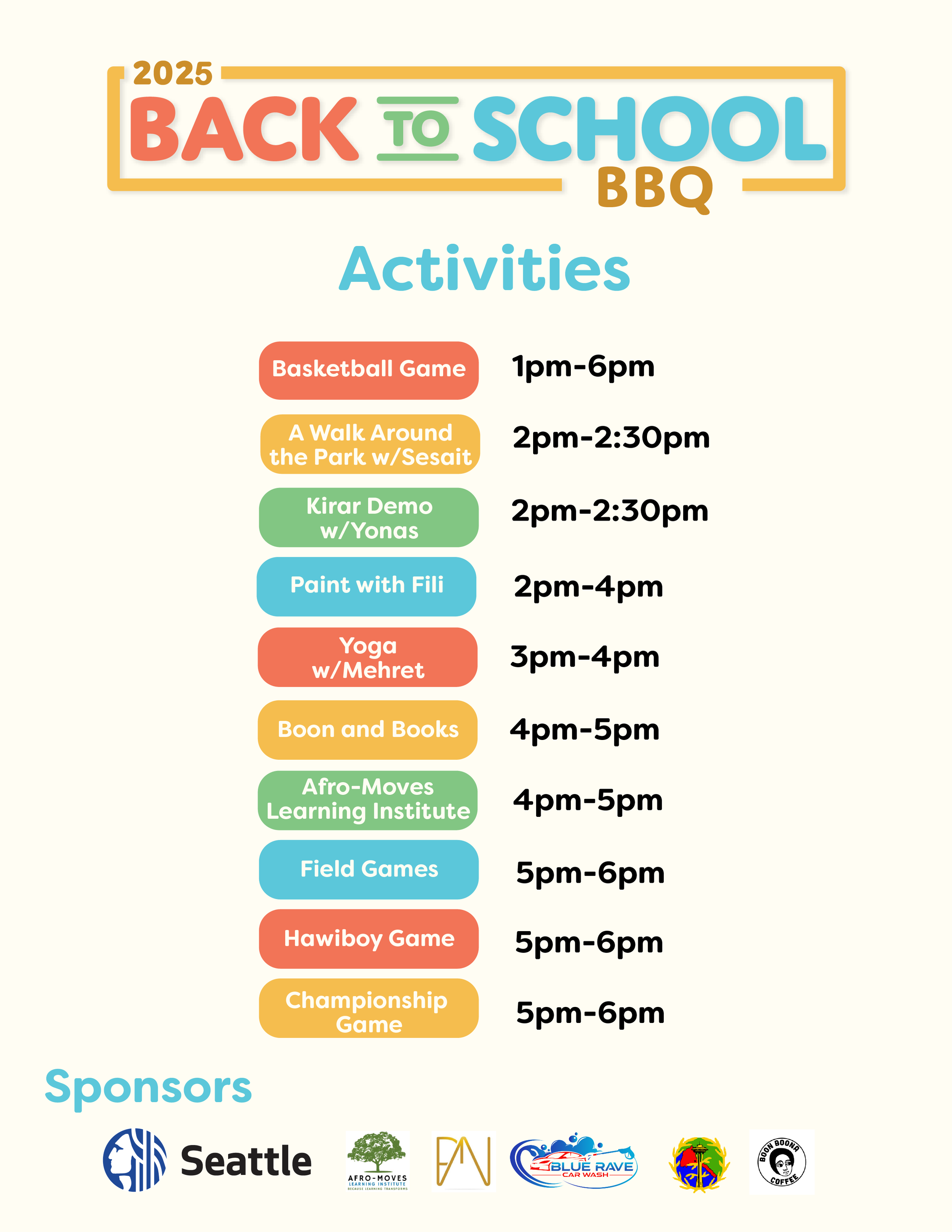
Activities are grouped together using color-coded text to make scanning easier.
Contact information is placed at the bottom, consistent with public service materials.
Cultural & Equity Considerations
The inclusion of Eritrean cultural references (such as the kite featuring Eritrean colors) is subtle and celebratory, not overwhelming.
Language is straightforward and accessible, avoiding jargon.
The illustration style removes reliance on literacy alone, making the message more universally understandable.
Accessibility & Public Use Considerations
High contrast between text and background improves legibility.
Large type sizes support readability for all ages.
Simple iconography and illustration reduce cognitive load.
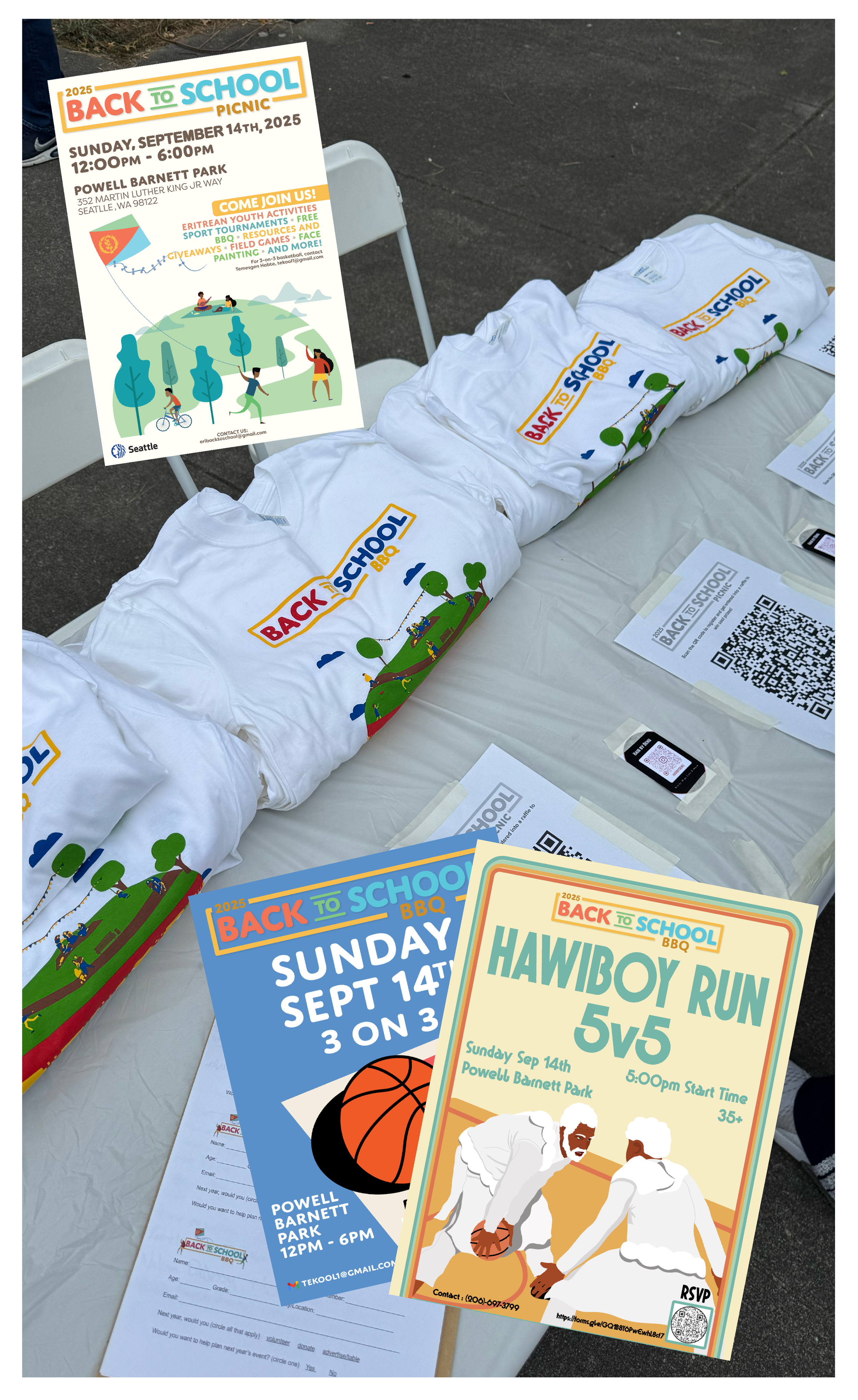
The layout is adaptable for multiple formats (poster, social media, flyers).
Outcome
The final poster successfully communicates:
What the event is
When and where it takes place
Who it’s for
Why people should attend
It functions as both a community invitation and a public information tool, balancing warmth with clarity. The design supports behavior change by encouraging families to gather, access resources, and engage in youth-focused activities.
Reflection
This project demonstrates my ability to:
Translate complex event information into clear, engaging visuals
Design for diverse, multigenerational audiences
Apply equity and accessibility principles to community-facing communication
Create work that feels human, joyful, and trustworthy—without sacrificing clarity