

Make it stand out.
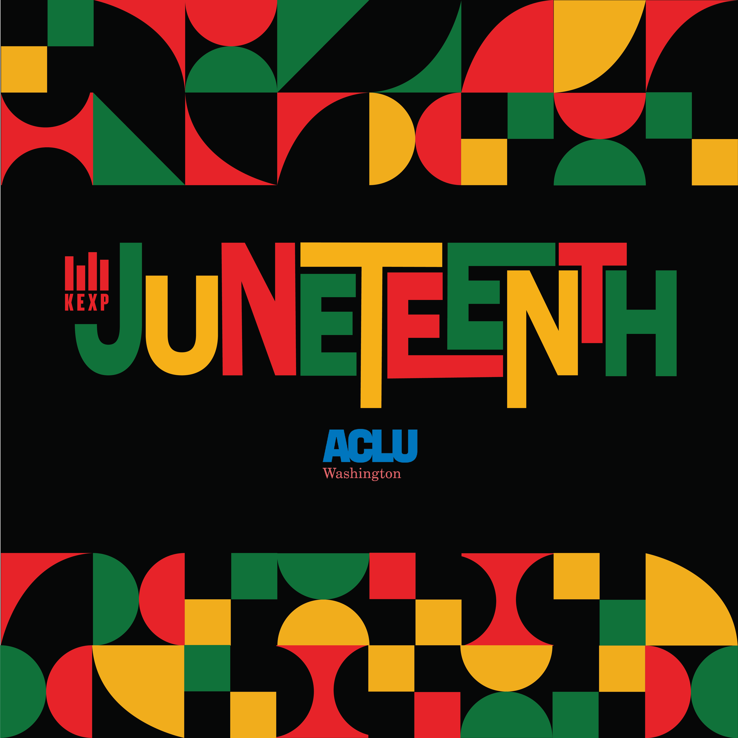
I was tasked to create a logo for KEXP Radio Juneteenth Campaign. I had to create a logo that was crossfunctuional across all social media mediums. The goal of the project is to Increase awareness and recognition of Juneteenth as a historic and living holiday.

Project Overview
Project: Juneteenth Community Awareness Campaign
Partners: KEXP, ACLU of Washington
Role: Graphic Designer / Visual Strategist
Mediums: Poster, digital graphics, social assets
Audience: Multiracial, intergenerational public audiences across Washington State
Challenge (Public-Sector Framing)
Juneteenth commemorates the emancipation of enslaved African Americans, yet public understanding of its history, significance, and contemporary relevance varies widely across communities.
The challenge was to design a visual system that:
Honors the cultural and historical weight of Juneteenth
Feels celebratory without being commercialized
Communicates clearly across diverse audiences
Is immediately legible in public, high-traffic environments
Aligns with equity, inclusion, and accessibility values
Goals & Desired Outcomes
Increase awareness and recognition of Juneteenth as a historic and living holiday
Create an inclusive visual language that resonates beyond a single demographic
Provide partners with flexible assets adaptable across platforms
Encourage reflection, participation, and cultural respect
Strategy (How Design Solves the Problem)
Rather than relying on literal imagery, the strategy centered on symbolic abstraction—using color, geometry, and rhythm to communicate meaning.
Key strategic decisions:
Use of Pan-African color palette (red, black, green, gold) to ground the work culturally
Modular geometric forms to reflect collective history and continuity
Strong typographic hierarchy for immediate recognition
High contrast compositions to support accessibility and distance viewing
This approach allows the work to feel timeless, civic-minded, and scalable—qualities essential for public-sector communications.
Design Solution
Visual Language
Geometry: Circles, half-circles, and blocks symbolize unity, cycles, and progress
Pattern System: Repeating forms reference collective movement and shared history
Composition: Dense patterning framed by open space to balance energy and clarity
Typography
Bold, sans-serif letterforms for clarity and authority
Custom typographic arrangement of “Juneteenth” to feel celebratory yet grounded
Clear reading order to support fast comprehension in public spaces
Color & Accessibility
High-contrast color combinations for visibility
Limited palette for consistency across print and digital
Color choices rooted in cultural meaning while meeting legibility standards
Equity & Inclusion Lens
This project was developed with an intentional equity framework:
Avoided stereotypes or literal depictions of people
Designed for cultural respect rather than spectacle
Ensured visual clarity regardless of language proficiency
Created assets adaptable for multiple communities and contexts
The abstraction allows viewers from different backgrounds to engage without exclusion, while still centering Black history and liberation.
Collaboration
Worked within partner brand systems (KEXP, ACLU)
Balanced multiple organizational identities while maintaining visual cohesion
Designed assets flexible enough for reuse across campaigns and years
Outcomes & Impact
Created a recognizable, shareable Juneteenth visual identity
Supported community education and cultural acknowledgment
Provided partners with a durable system adaptable across mediums
While specific metrics were not available, the campaign functioned as a public-facing cultural signal—visibility, recognition, and respect.
Reflection (What This Shows)
This project demonstrates my ability to:
Translate complex cultural history into clear visual systems
Design for public audiences with equity at the center
Balance symbolism, accessibility, and institutional needs
Create work that supports awareness and behavioral reflection, not just aesthetics
This approach aligns closely with public-sector and transit-agency creative work, where clarity, inclusivity, and trust are essential.